THE CHALLENGE
The objective of this project was to improve an existing e-commerce website’s performance and usability to enhance user satisfaction. For this project, I redesigned the SVP Sports website to develop my skills in evaluative research, information architecture, and user interface design. I created a mid-fidelity prototype to assess usability, which informed the necessary changes for a finalized high-fidelity prototype.
I selected SVPSports.ca, a Canadian sporting goods retailer that offers a wide range of high-quality products for sports enthusiasts, athletes, and outdoor adventurers. According to Barilliance, the average cart abandonment rate for desktop e-commerce sessions is 73.07%. My goal was to answer the question, “How can I lower this rate?”
Current Design

My Approach
As a solo Product Designer, I recognized that SVP Sports needed a streamlined and focused design to improve how the business connects with customers online. By blending vibrant visuals with seamless functionality, I aimed to create a smooth and enjoyable user experience. From browsing the menu to placing an order, the SVP Sports redesign emphasizes simplicity, speed, and successful purchases—all while maintaining a modern, professional feel that reflects the brand's identity.
User Interviews & Usability Testing
I conducted interviews with four participants: three classmates (Theraune, Vicki, and Jarrett) and one acquaintance (Nikeisha). The interviews aimed to understand users’ motivations for shopping online. Key reasons included involvement in physical activities like jiu-jitsu, soccer, and road cycling. Participants also wanted to explore product selections and alternatives. Additionally, they sought reassurance before making purchases, often looking for specific sizes or styles unavailable in-store.
Insights from these interviews led to the creation of an affinity map that highlighted common themes. For instance, interviewees mentioned browsing online to purchase sports apparel as gifts for loved ones.
During usability testing, participants noted that the SVP Sports homepage was overwhelming. It displayed numerous brand logos, promotions, secondary navigation systems, store reviews, and social media content. Clicking on a brand logo led to a generic product landing page (PLP) instead of a branded page. Multiple navigation systems on the homepage confused users, especially when positioned midway on the page. Misaligned formatting in the review section caused users to spend unnecessary time on the site and consider competitor websites. However, users had no issues completing the checkout process.
Sketches

Affinity Map
Click the image below to read the entire themes:

Persona
Based on interview data, I developed a persona: Mark Johnson, a 47-year-old Senior Technical Lead in California who enjoys trail running and road cycling with his wife. His goals reflect common interview themes: he seeks to improve his health through an active lifestyle and wants easy access to user reviews and promotions without distractions. However, he faces pain points like spending excessive time understanding product features and unclear in-stock status for specific sizes.

Identifying Unique Challenges
E-commerce sites face the challenge of balancing aesthetics with functionality, ensuring that interfaces look appealing while performing flawlessly. Customers must be able to navigate menus quickly, find essential information, and complete purchases with minimal friction. My goal was to address these challenges by offering a clean, user-friendly layout that intuitively organizes content.
Sitemap
The original SVP sitemap was broad and deep, contributing to users’ sense of overwhelm. I created a new, streamlined sitemap to help users find items more quickly. Addressing user frustrations, this new layout reduced on-screen information and minimized mental exhaustion, potentially lowering cart abandonment rates.

Resolving Complex Problems
From creating a scalable digital platform to keeping customers engaged, I aimed to solve key issues for e-commerce businesses. I focused on ensuring that the redesign maintained responsive functionality across all devices—desktop, tablet, and mobile. If I had more time, I would have researched features and layouts that optimize for SEO, enabling the site to rank well on search engines. In theory, this would ensure quick load times, even during high-traffic periods, preventing customer drop-off.
User-Centric Design
I wanted the SVP Sports refresh to be completely user-centric at the core of its functionality. I did this by anticipating the needs of my users which meant providing easy-to-access information and a clear path from browsing to checkout. The homepage invites users with vivid imagery and engaging text styles, while the slideshow feature lets you highlight special offers, best-selling sporting goods, or promotional events. The menu has clean, readable layouts that make it easy to navigate, ensuring that customers can find what they’re looking for without hassle.
Lo-fi & Hi-fi Wireframes
After sketching initial redesign ideas, I created wireframes focused on five core pages: the homepage, PLP, product description page (PDP), checkout page, and confirmation page. I used a column grid system to ensure a professional and organized layout. Inspired by competitor websites, I developed a header navigation menu based on the new sitemap from my FigJam board.
The navigation menu was created as a component with nested dropdown functionality, enhancing the user experience. I referenced YouTube tutorials to set up dropdown menus and filters on the PLP. I then converted greyscale wireframe components into high-fidelity (hi-fi) objects with images and a fresh color palette. In prototype mode, I linked the five core pages to create a seamless flow: from the homepage, users click on “Men’s > Footwear” in the navigation menu, leading to the PLP, then select a product to view its details on the PDP, add it to the cart, and proceed to checkout. The checkout page includes express payment options (Apple Pay, Google Pay) with a manual form option for those without express payment.

Detailed Pages and Features
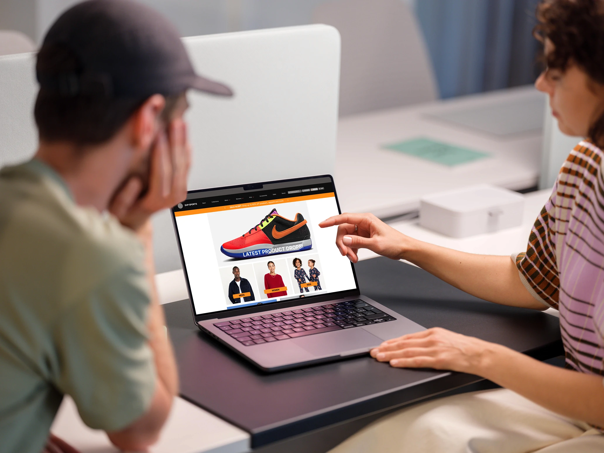
Home: A vibrant, welcoming introduction to the business, complete with a dynamic slideshow to highlight the latest sporting goods, newsletter signup, and promotions.
Menu (CMS): A fully customizable menu where items can be added, edited, or removed. The layout is designed for readability and appeal, encouraging customers to explore and order.
Contact: A clear and accessible contact page that makes it easy for customers to reach out.
Product Landing Page (PLP): A minimalist grid pattern displaying product costs and available color options.
Product Description Page (PDP): A sleek carousel showcases the product from multiple angles. An accordion menu avoids overwhelming users with too many store policy details at once.
Checkout: Provides clear payment and delivery requirements, offering SVP Sports customers peace of mind.
Confirmation Page: Informs users that their order was placed successfully and that they’ll receive an email confirmation shortly.
Accessibility and Optimization
The SVP Sports redesign is fully A11y optimized, ensuring accessibility for all customers, including those with disabilities. Features like screen reader compatibility and intuitive navigation broaden the site's usability. The redesign also integrates modern web fonts and components that enhance user experience while maintaining strong performance. If I had more time, I would have incorporated a fully responsive design to adapt fluidly to any device, guaranteeing a flawless experience on mobile, desktop, or tablet.
CONCLUSION
This project was an eye-opening experience that allowed me to create a complete solution for existing e-commerce businesses seeking to enhance their online presence and engage customers meaningfully. My goal was to reduce cart abandonment rates for SVP Sports by offering a seamless online shopping experience.
I learned the importance of grid layouts and how components streamline the prototype development process. One rookie mistake was merging general questions about online shopping with usability testing, leading to extra time spent reworking questions and following up with interviewees—time that could have been used to refine my greyscale prototype.
Despite this, I successfully created a functioning hi-fi prototype that met the following criteria:
Improved navigation and user flow
Enhanced product descriptions and media
A simplified checkout process
When I presented the redesigned SVP Sports website to interviewees for usability testing, the feedback was overwhelmingly positive, praising its neat layout, superior navigation, and vibrant colors. This project helped me grow as a designer, and I believe it offers a valuable strategy for reducing cart abandonment rates, ultimately increasing profitability for e-commerce businesses.